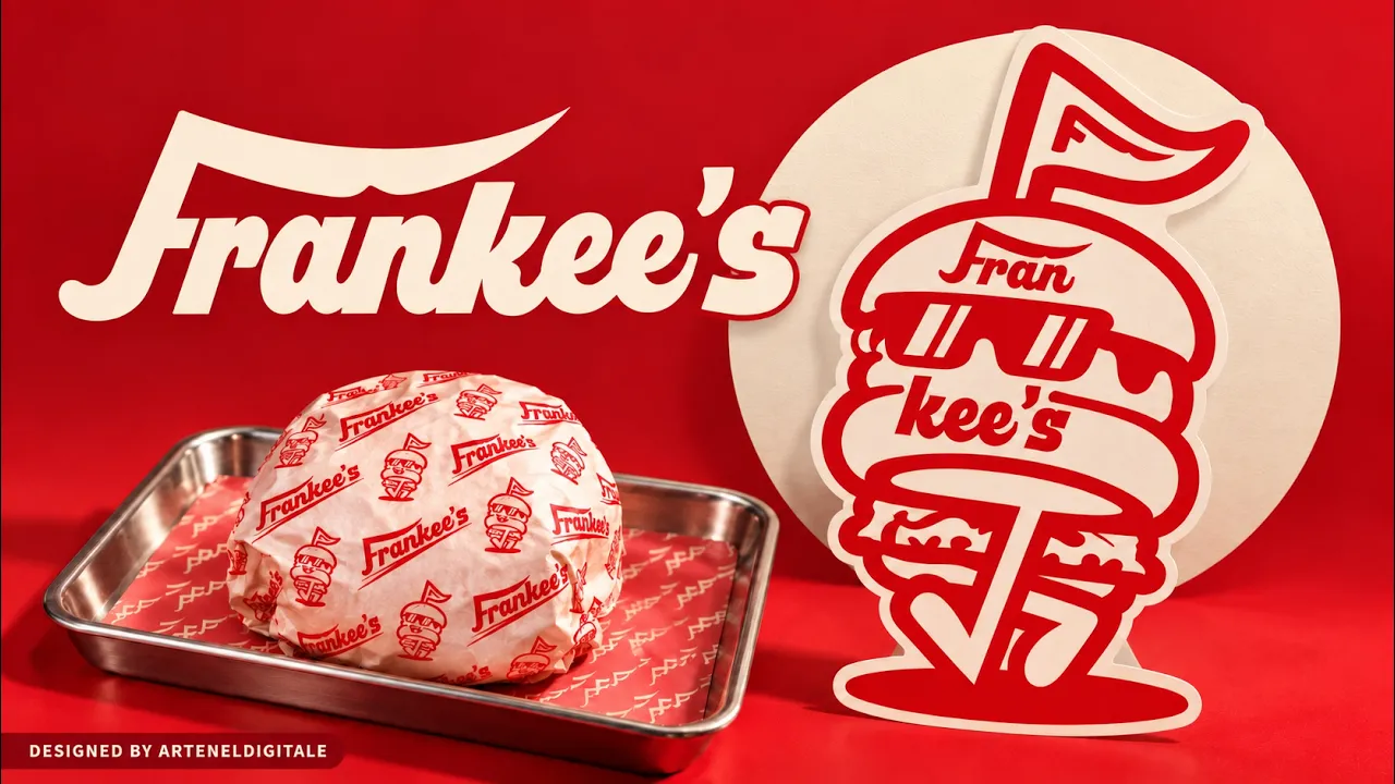


The design challenge was to give Frankee’s a recognisable personality that could work beyond its logo. The identity needed to feel bold and playful while remaining coherent across food packaging, small-format graphics and staff apparel.
We developed a custom wordmark and burger mascot, supported by a red-and-cream palette, graphic patterns and expressive typography. The “Smash. Eat. & Repeat.” message tied these elements together, creating a consistent visual language for the restaurant’s branded materials.


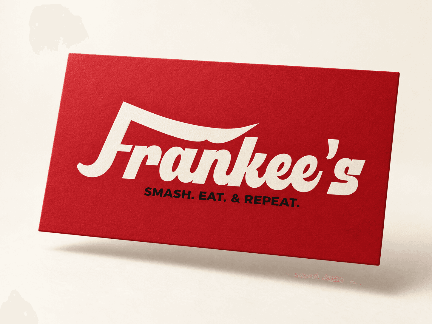
A cohesive restaurant identity that combines distinctive lettering, a character-led mascot and coordinated packaging and apparel applications.
Delivered in 2024, the three-week project covered logo design, mascot development, visual identity and packaging design. The completed materials demonstrate how the Frankee’s identity translates across burger wrapping, tray liners, stickers and staff aprons. This case study presents the design work without making claims about the restaurant’s current operations or commercial performance.
Next projects.
(2016-26©)