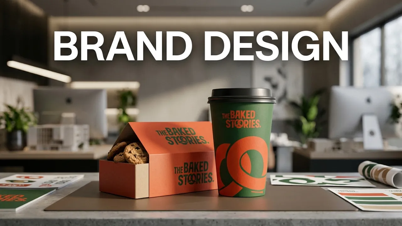

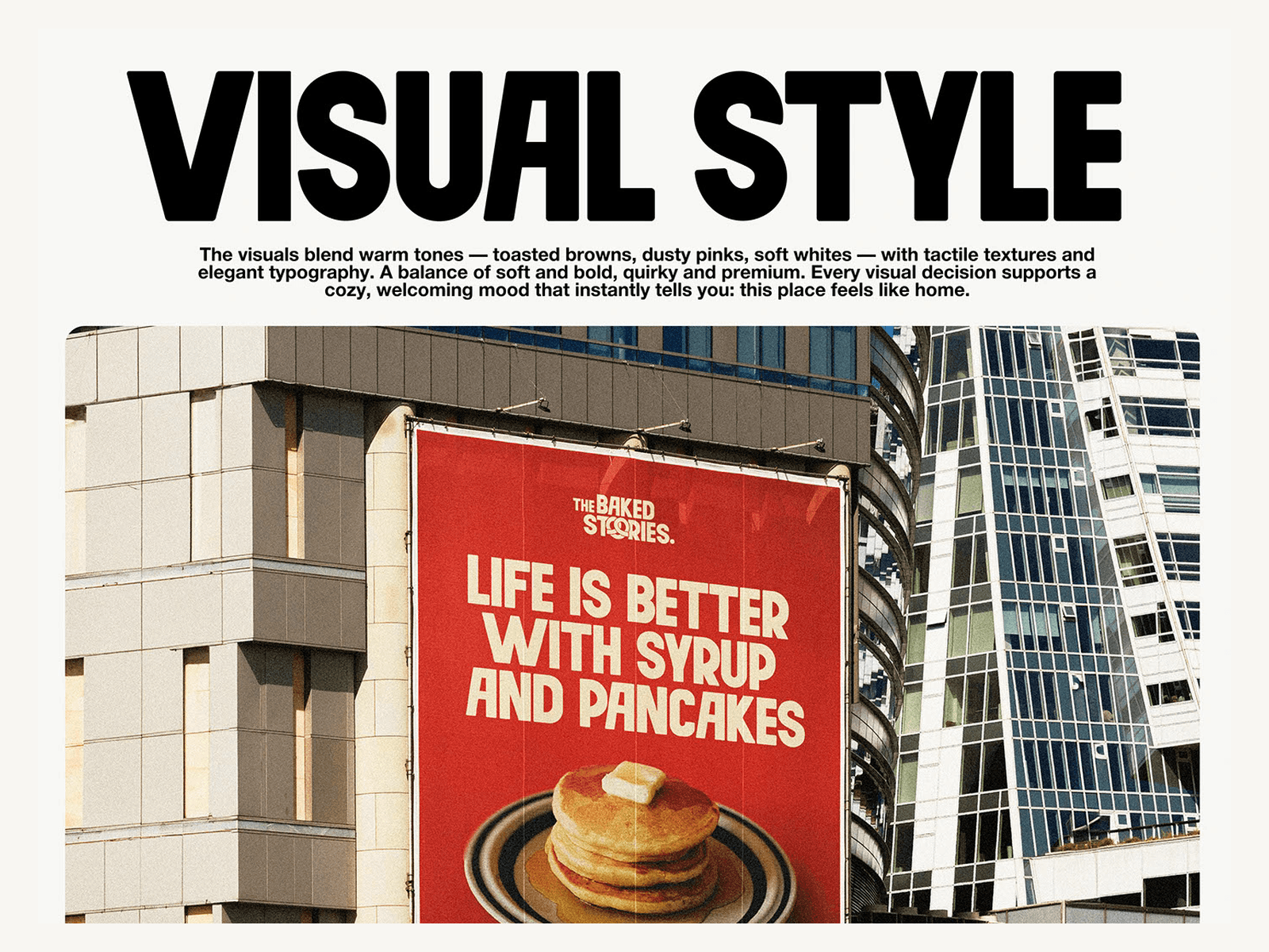
The Baked Stories needed to feel handcrafted without becoming rustic, and nostalgic without looking dated. The identity had to remain instantly recognisable across everything from small packaging details to street-scale signage, vehicle graphics and digital formats.
We created a bold condensed wordmark centred on a pretzel-shaped “O”, then developed a flexible system of earthy colours, expressive typography, tactile imagery and confident compositions around it.


A memorable identity system that carries one cohesive story across every scale — from bakery packaging to storefront signage, vehicle applications and digital screens.
The resulting visual toolkit gives The Baked Stories a consistent foundation for print, environmental and digital communication while preserving the warmth and personality of a neighbourhood bakery.
Next projects.
(2016-26©)